Making visually appealing PowerPoint presentation takes, I believe, creativity, instinct and most importantly common sense.Here's an example of my work. I was asked to update an old PowerPoint presentation for a CV and Cover Letter seminar. Normally I wouldn't explain how I create stuff because I believe the magic is in the mystery, and people tend to think that just because you can summarize what you did in a few lines it means the process that got you to the final product was also short. But this time I think I should showcase it.
Here's what I did (everything but the text came out of my head). See presentation below.
1st. Changed the aspect of the presentation to 16:9 (wide). I'm not a fan of square PowerPoints because they leave a lot of unused space and because the side margins are black. Plus, most laptop monitors are widescreen.
2nd. Picked a color scheme, in this case: purple. Why? I liked it.
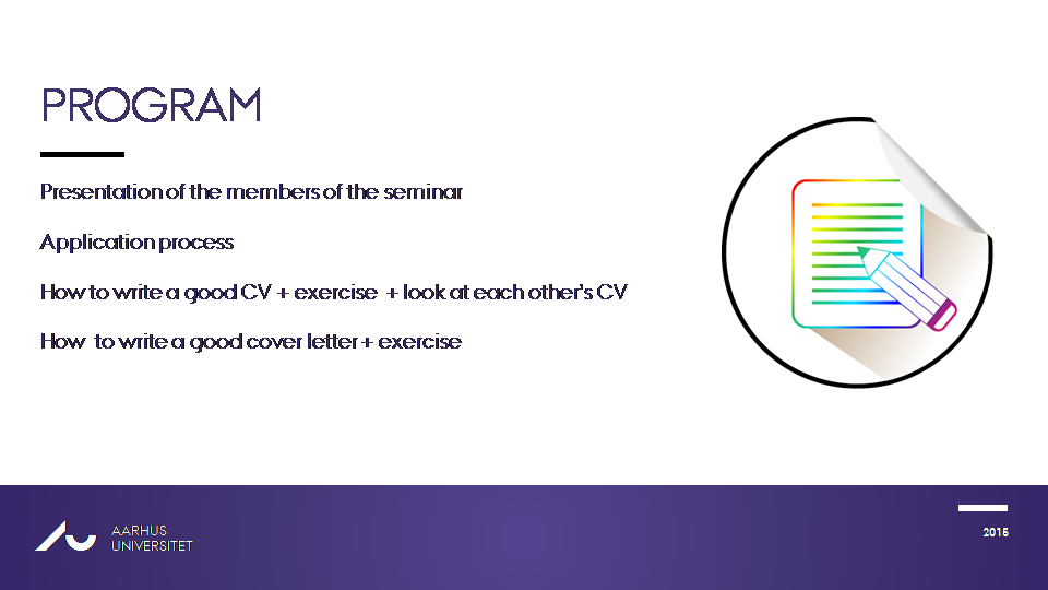
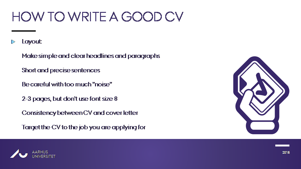
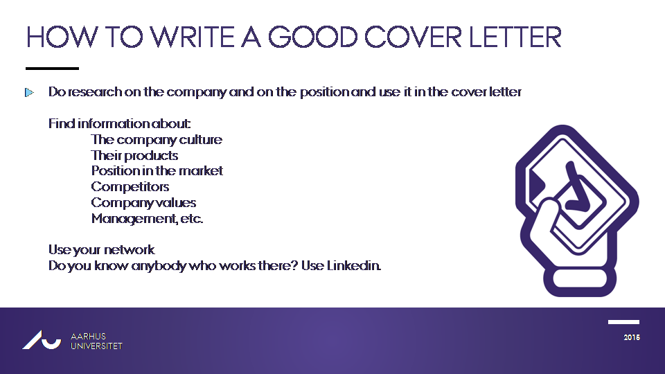
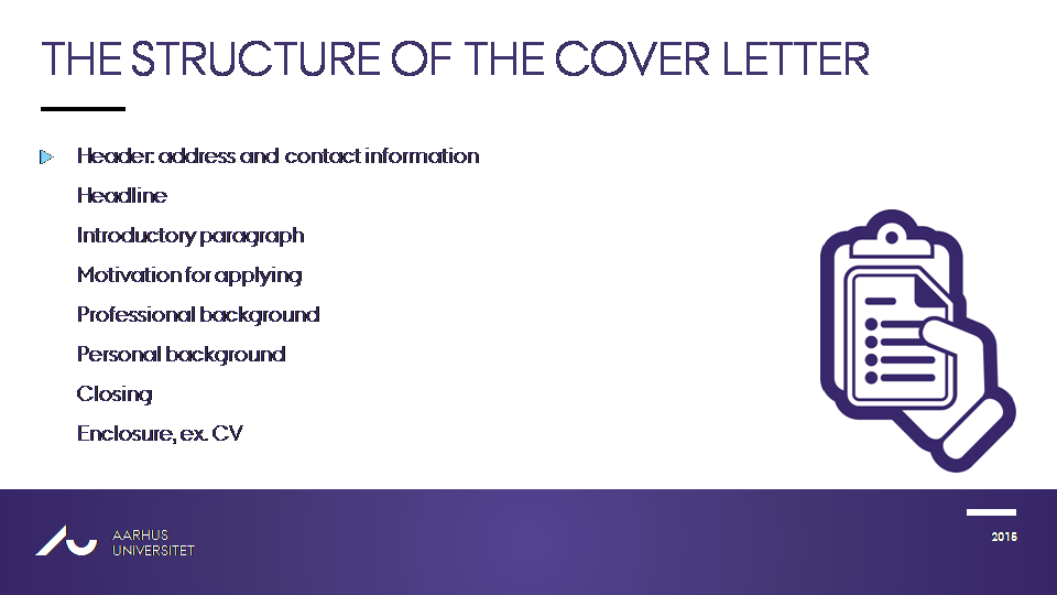
3rd. Added a beatufiul, high resolution front picture. Added various graphical elements on different slides, (ex: hands, badges, images) some of which I had to edit by adding dialogue or other graphical elements, or change their color to purple.
4th. I formated all the text and removed all the initial images which were positioned wrong (over edges, over other elements etc.).
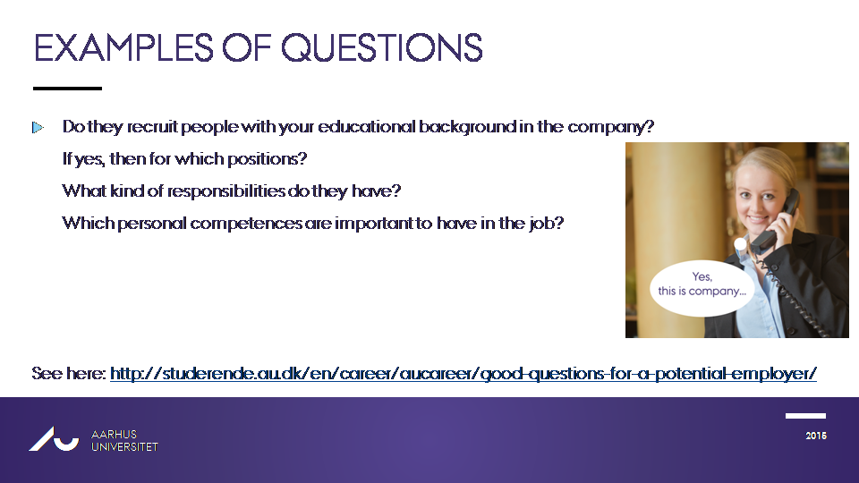
5th. Added my own brand of humor - the picture of the dog & lady talking on the phone. I edited these two pictures by adding a speech bubble and adding the dialogue. The dog says "Hello, is this company?" and the lady answers "Yes, this is company". First of all, the pictures fit the context (check the information on the slides) and second of all, the dialogue makes them hilarious. Why? Because... talking dog...